 How To Create Animation
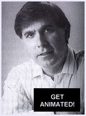
Interviews by John Cawley Backgrounds PHIL PHILLIPSON INTERVIEW DATE: JULY 16, 1990 Back To Contents Back To Books Page |
INTRODUCING PHIL PHILLIPSON...
Phil Phillipson has been a fixture in background painting for over a decade. His background of working in almost all aspects of the business gives him a unique feel for the business. He's done editorial work (PENELOPE PITSTOP, SCOOBY DOO, GARFIELD AND FRIENDS), assistant animation (METAMORPHOSES, THE BLACK CAULDRON), layouts (FANG FACE, THE SMURFS, OLIVER AND COMPANY), backgrounds (SUPERFRIENDS, HEAVY METAL, HEIDI'S SONG, FAMILY DOG, THE GREAT MOUSE DETECTIVE) and color styling (MUPPET BABIES, Bakshi's HARLEM SHUFFLE video, DUNGEONS AND DRAGONS). He's worked at about every studio from Hanna-Barbera to Bakshi to Disney. His current efforts include the 1989 smash hit THE LITTLE MERMAID and more recently THE RESCUERS DOWN UNDER. We caught Phil at a private residence where he discussed just about every aspect of the painter's life.
Q: Please give a brief description of your career, studios
you've worked for and productions you've worked on.
PP: Originally I wanted to draw comic books. I've loved comic
books ever since I was nine years old. My dad gave me a George
Bridgeman anatomy book, and that's what got the whole thing
started as far as art goes. From that George Bridgeman book I
knew I wanted to be an artist more than anything else in the
world, well, maybe a baseball player (laughs).
With that Bridgeman book I immediately discovered that when you
draw a hand, instead of a circle with five little points coming
off it, there's all these angles and intricate interlocking
wedges and blocks. From that point comics were a natural
progression where Bridgeman's principles were being utilized.
Some of my favorite artists as a kid were Jack Kirby, Joe Kubert,
Carmine Infantino, Gil Kane and Mike Sekowsky. I was in High
School when I discovered Neal Adams, Bernie Wrightson and Jeff
Jones and decided that's what I wanted to do professionally when
I graduated.
I went to junior college and took some art courses there. At that
time I was working in a hospital, washing dishes, and a friend
says, "hey, you know if you're interested in artwork why don't
you go to Hanna-Barbera?" I had no idea who they were or what
animation was, but they were only 20 miles away and that was a
lot closer than New York! I went down to Hanna-Barbera and
applied. I didn't know what the job functions were and I said I
just wanted to be an artist and they sort of laughed. They said,
"What kind of artist?" I had no idea that there was Layout,
Background, Animation, Xerox and film editing. I just wanted to
draw.
The lady at the reception desk was very nice. She said, "Well,
why don't you start in the mail room. That way you'll get
exposure to all the other departments." They immediately hired me
for the summer. I figured once you get a job you just keep
working forever. I didn't realize what a layoff was (due to the
fact a series does not go on forever). Of course, I was lucky in
the mail room. They didn't get layoffs because it was the
cheapest paying job. I only made two dollars an hour at that time
in 1968.
I was in the mail room for about six months when I got my first
break doing editorial work for Larry Cowan. My first promotion
was to track reader. That's where you break down the mouth
assignments for the animator on the exposure sheets. After that I
was constantly bugging Iwao Takamoto [major stylist for Hanna-
Barbera] for a job in layout. That was the closest thing that I
could do as far as comic books go. My goals took a turn when I
met an older gentlemen by the name of Paul Julian. It was Paul's
brilliant backgrounds that opened my eyes to the infinite
possibilities of color that totally changed my career goals from
comics to painting.
So from editorial, which I was working full time at that time,
from 1968 to 1972 I was always bugging Iwao for a job in layout
and finally I got my first chance in 1973 on INCH HIGH PRIVATE
EYE. From that, because it was a busy season, I got a chance to
go into background. From that point I worked at Hanna-Barbera off
and on because of the various layoffs.
Starting in 1976 I began moving out of Hanna-Barbera into various
other studios. The first non-H.B. Studios, was Sanrio where I
was an assistant animator. That was my first theatrical film.
Other studios I worked at were Ralph Bakshi's, dePatie-Freleng,
Ruby-Spear, Columbia, Filmation, back to Hanna-Barbera and all
around town.
I came to Disney in 1983 on THE BLACK CAULDRON as an assistant
animator. Again, trying to break in as a painter. Through these
various careers I was taking night classes at Art Center from
1971 through 1978. In 1985 I got a chance to work at Disney as a
background painter exclusively.
Q: What tools do you work with?
PP: The brushes that I personally like and use are Brumbacher
number 6142, Aqua-rel. I use the half-inch, three quarter-inch
and one-inch chisel brush. My round head brushes are Isabee
special series Colinski, 6227Z and I use the number fours, sixes
and eights. Most of my work is done with those brushes. Very
rarely will I deviate from those unless there's a special project
or a special technique that's employed and I have to follow. But
basically those brushes will carry me through anything.
Q: What sort of paints do you generally use?
PP: Saturday morning studios were basically using vinyl acrylic
paints. That's acrylic with vinyl, which has a plastic base to
it. It's very permanent. It doesn't fade, doesn't bleed or
anything, it's just forever.
Disney had their own special paint department that blended their
own pigment. It was like gauche or tempera. It was not
permanent so that if you spilled your coffee or your water on it,
it would disturb the surface, whereas vinyl acrylic you could
spill coffee on it and it wouldn't do anything to it. You just
wipe it up like a vinyl floor.
Q: On Saturday morning and feature films, the first step in doing
backgrounds is establishing what they call a color key.
PP: Yes. Color keys use color to design and style a particular
locale. The studio or project will determine how abbreviated or
fully rendered each key will be. Depending on the amount of
freedom each studio allows its BG department determines if a
supervisor or each painter gets to do his or her own keys. From
the keys each painter than prepares his background as camera
ready artwork. Each process has its own individual challenge.
Features are generally more muted using very subtle hues and
values. Saturday morning on the other hand has to pump up the
chroma, hue, and values across the board to compensate for all
the generations that will take place before broadcast. The steps
being film to tape to broadcast and the final kicker *your* TV
set. Everyone's TV seems to be adjusted slightly different from
everyone else's.
Theatrically, the key word is control. Theater screens don't have
scan lines and all are basically the same, except for size.
Therefore you can get those muted grays, you get those subtle
values and harmonies of color that you can appreciate. The TV
just doesn't pick it up. Or if it does pick it up it just doesn't
do it justice
Q: Can you give examples of films with good backgrounds?
PP: Yes, BAMBI, LADY AND THE TRAMP, PINOCCHIO, all those old
Disney classics. Those were some of the most gorgeous backgrounds
ever painted. And it's very interesting about those backgrounds.
I've had a chance to go to the Disney morgue and see them up
close and they don't look at all like they do on film. They're
still very beautiful backgrounds and very well painted. The
surprise from seeing them up close is that you realize
immediately that they were painted for film, not as
illustrations.
There's two schools of thought concerning background painting,
and that is painting versus rendering. The rendering school wants
to achieve ultimate realism which does not heighten the sense of
bigger than life or fantasy of a particular scene.
The painting school is more impressionistic and deals a little
more with values of lights and darks placed next to each other.
That's the key thing you'll see in the old Disney backgrounds
when you finally get a chance to see them up close. The painting
ability of those painters was incredible and second to none. They
were paintings as opposed to renderings.
Q: What's the difference between a painting and a rendering?
PP: To simplify it, let's say you have an example of a house,
with a wood shingle roof. The rendering of the roof will have
each shingle delineated, light, medium and dark. A painting will
have one light brush stroke placed next to a dark brush stroke so
that when the pattern is repeated it will create an impression of
realism using a painterly system.
A rendering when held in front of you, will look very similar to
a book illustration. It will look beautiful. The craftsmanship
will be exemplary. On the other hand, a painting in front of you
might not look so good because it's being held out of context.
You also have to consider screen time, the preceding scene and
the succeeding scene.
When a director's notes call for a particular scene to be two
feet long, a little over a second and a half, which is a blink of
an eye. A painting holds up during screen time, or a director's
timing, better than a rendering. A painting will have the
immediacy of the light and the dark, as opposed to a rendering
where you have subtle nuances that no one will ever see except
for the person holding it in front of him.
Q: How do you go about converting a layout into a final
background or a production background?
PP: I transfer it with graphite paper. It's similar to carbon
paper, but rather than carbon, its coating is just like your
graphite pencil. You put that underneath the layout and then you
transfer the image with a stylus, which looks like a fine-point
needle, onto your background board.
The background board is usually Strathmore, cold press, hundred
pound weight. Sometimes they'll go three hundred pound weight.
The only difference is it's a little bit thicker backing. But as
far as the surface that we paint on, it's equal. There's no
difference there. The Strathmore board is a little bit nicer as
far as preservation goes, an archival-type quality. Now, at
Hanna-Barbera where I started we didn't have that. It was like a
Strathmore two-ply. It's what a comic book artist would use,
like bristle board. It was thinner. When it got wet, it was like
a potato chip. You had to mount it onto a board as opposed to
being on a board from the beginning.
Q: How do you actually paint a production or key background.
PP: Use the comparison between Saturday morning and theatrical.
Both processes are approximately the same. The only difference
is that in Saturday morning you'll probably have a little bit
more liberty and freedom to do what you want. You can probably
assert yourself artistically more than you can in a theatrical
where you have to more or less follow closely the people you're
working with. But you make up for it by having enough time to do
the absolute best job you can.
Theatrically if you've got four people or twenty people painting
backgrounds, they're all supposed to look like one person painted
the product. Now, on Saturday morning that still holds true.
Although along with following the general style like on SCOOBY
DOO you could always experiment. And that was more or less
encouraged because you're compensating for lack of animation.
When something looked striking value-wise or color-wise it was
encouraged to go with it. In a theatrical you're trying to use
subtle hues and values because you'll be able to see the
subtlety. Theatrically the animation is dominant so you don't
have to compensate with harsh values and hues. Each has its own
discipline and each is fun to paint in its own way
Q: After you've transferred the layout onto the background board,
how do you actually get down to physically starting it?
PP: Always start like the namesake. You start in the background
first and then come forward to the foreground. So you go
background, middle ground, foreground. You do the things
furthest away from the foreground, like the sky or clouds, then
you come forward from the mountain. The furthest mountain range
up to the closest mountain range, then to the foreground where
your main characters stand.
Q: Who, on an average day in production, do you generally work
with?
PP: Theatrically, where I'm at right now at Disney, we have a
background department and the work is disbursed from our
supervisor. They will take portions of a sequence and divide it
up amongst the department and they would then give either one
layout or several layouts, depending on how fast the work needs
to be done.
I'll take that layout and go back to my desk, usually in the
morning, and set my station up. To accommodate that particular
layout I'll go to the file drawer and find other backgrounds in
that particular section that have been painted. If there are none
then the supervisor will probably give me a small color key to
follow. At that point I will interpret those colors either color
for color or I will have to extrapolate the mood of that
particular scene and then proceed to paint it. After I've
acquired all my research material from the file cabinet, I will
then go back to my desk and start to paint it.
Q: Are you checked on by anybody as you progress?
PP: Yes. Usually at the very beginning of a movie there'll be a
lot of experimentation. You can try different styles. The art
director or the directors will decide if it's hitting the mark or
not. That's usually the most fun because you get to experiment.
Then as the production progresses it gets finely tuned and
finally there is no more experimentation. Depending at what
period in the production I'm in, will determine how much research
I require. Towards the end of the production there is lots to
choose from. Therefore, the research acquiring portion of the
day is very minimal, if any at all.
Q: What projects have you worked on that you've really enjoyed
and why?
PP: ROGER RABBIT. It's a real toss up between ROGER and LITTLE
MERMAID. The reason why ROGER gets the nod is purely from a
creative standpoint. ROGER's the only Disney production where I
was called in on the very beginning of a project and asked to
design in color. But because I was already assigned to another
feature, I had to do Toon Town at night, after hours. That caused
the time schedule to become strained. Because of the crunch, they
needed someone else, so they called in my brother, Andy
Phillipson. It was great working with Andy as co-designers on
ROGER. Unfortunately, two people doing work at night still wasn't
enough. (Andy was also involved with another project during the
day.) They were lucky enough to get Ron Dias full time and rest,
as they say, is history. Andy and I didn't receive any film
credit, but we had the satisfaction of being in at the beginning
of one of the greatest movies of all time.
Conversely, MERMAID, my other favorite, was second only because
the work I did do on it was of a following nature; implement and
execute other designers' work. This carries a different type of
satisfaction, though.
The biggest conflict I have with myself is how powerful my
contribution is measured against how good the project
materializes. It's like being on a team. You may have a great
game with terrific stats but the team loses. That's not good. Or
your on an all-star team and they blow out the league, but you
didn't contribute very much. That's not satisfying either. The
ideal is to do great work on a great project. That's the
combination I'm always striving for.
Q: How would you tell someone to prepare for getting into the
animation industry?
PP: If I knew what I know now back then I would've gone to art
school right out of high school. That's the best training. Art
Center School of Design in Pasadena or Cal Arts are the two best
schools for art in this area.
Unfortunately, all Saturday morning production is now done
overseas, leaving a huge void for gaining experience. The way I
started you wouldn't be able to duplicate; being an apprentice
and learning from a master.
Back To Contents
Back To Books Page
Back To Main Page